Brand
Kronex brand assets.
The name, the mark, the colours and the things not to do with them. Everything here is free to reproduce as shown.
Press · contact@kronex.network
01 · The name
Kronex is the network. KRNX is the asset.
The single thing most listings get wrong. If it runs, coordinates or settles it is Kronex; if it is held, paid, staked or priced it is KRNX.
the Kronex network
Kronex Improvement Proposals
KRNX, the native asset of Kronex
collateral denominated in KRNX
✗the KRNX network
✗KRNX Improvement Proposals
✗the Kronex token
✗collateral in Kronex
Setting it
Kronex is a proper noun in running text — sentence case, never all-caps. KRNX is a ticker: uppercase, monospaced where your house style monospaces tickers, and sitting beside USDT and BTC with identical treatment.
KRNXUSDTBTCSOL
02 · The logo
The lockup
One lockup at 3:1, and the mark alone. Those are the only two permitted forms, each in three colourways.
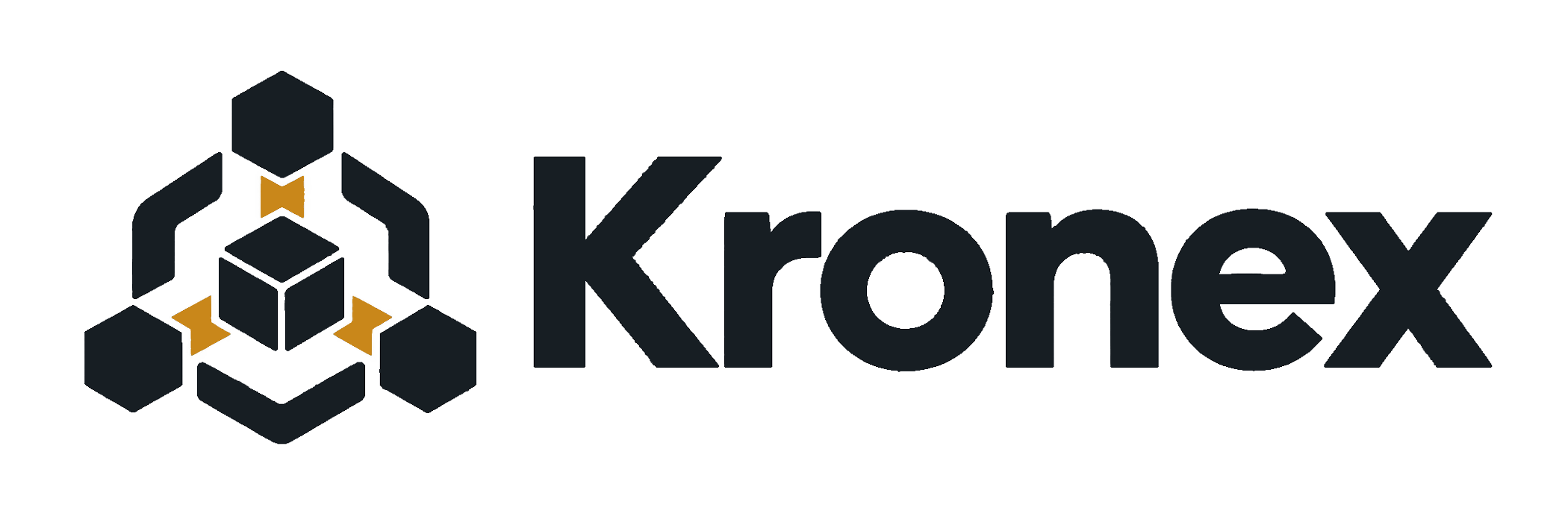

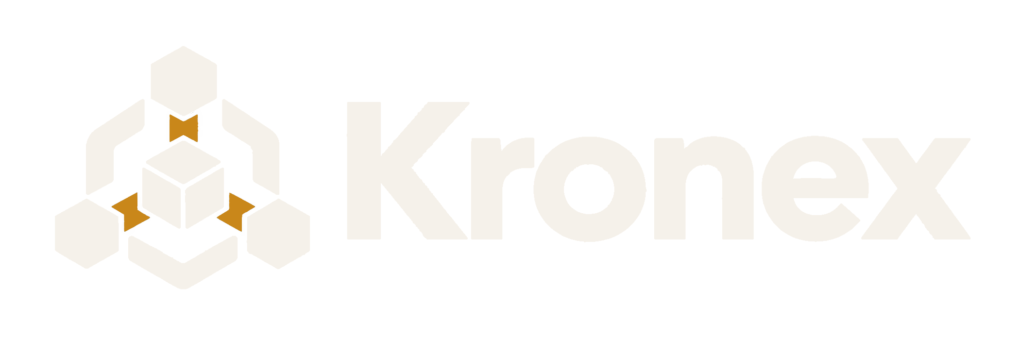

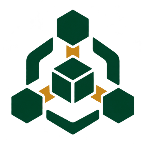
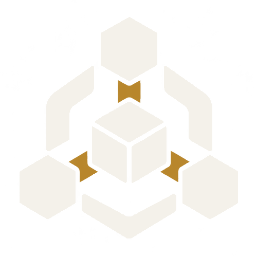
Which colourway
The dark colourway is primary and is the one used in Kronex's own chrome. The green is for contexts this project does not control — an exchange listing, a partner page, a conference backdrop — where a mark is expected to carry colour. The light colourway is the reverse: for dark grounds only, never on Parchment, Cream or Bone. Contrast is not what keeps the green out of the interface: it is legible everywhere. Coherence is.
Minimum lockup height 24px · below that use the mark alone · no colourway may be recoloured to another's ink or to a third colour
At a 96px lockup the mark is 96px tall, so clear space is 48px. Scale the margin with the logo — it is a ratio, not a fixed measure.
03 · Misuse
Seven things not to do
Each panel shows the wrong version. A list of prohibitions gets skimmed; a struck mark does not.
Kronex✗Do not split the lockup
The mark beside “Kronex” set in another face is half a logo. Use the lockup or the mark, never a rebuild.
✗Do not recolour either version to anything but its own ink
Two colourways means two inks: Bistre for the dark, deep green for the alternate. Neither may take a third colour. The four diagram marks never belong to the logo.
✗Do not place it on an accent fill
Parchment, Cream, Bone or white. The accent colours are never a ground for the logo.
✗Do not outline it
No hollow, no stroked, no knocked-out version exists. The logo is solid ink.
✗Do not stretch it off 3:1
The artwork is 2172 × 724, which is 3:1. Constrain by height and let the width follow.
✗Do not use the green mark inside a Kronex surface
The green colourway is for contexts we do not control. On cream, bone or parchment the dark mark is the only choice.
Infrastructure, coordinated✗Do not add a tagline to the lockup
There is no tagline lockup. Set a strapline as ordinary text beside or beneath the logo, outside its clear space.
04 · Colour
Colour
Surfaces and ink do the work. The four marks are dots inside diagrams — never a fill, a border or text.
- Parchment#d7d7d0
- Cream#f7f6f3
- Bone#fdfcfa
- Quill#e3e3de
- Flint#a8a7a1
- Graphite#66635f
- Slate#53504c
- Ash#2a2724
- Bistre#1a1614
- Chartreuse#e2e67d
The four marks
- Bistre #1a1614
- Structure and settlement.
- Orange #f59e3a
- Compute, GPU and hashpower.
- Olive #9a9d3e
- Privacy and verification.
- Chartreuse #e2e67d
- Liquidity, escrow and OTC.
05 · Typography
Type
Three roles. One of the three is licensed to Kronex only, and this section says which.
- Headings
- Test Signifier · Noto SerifA serif at regular weight, never bolded. Test Signifier is licensed to Kronex; Noto Serif is the wired substitute and what you should use.
- Body and UI
- GeistAny neutral grotesque substitutes cleanly. Sentence case throughout.
- Data and identifiers
- Geist MonoAny monospace substitutes. Tabular figures where numbers align.
06 · Downloads
Downloads
Raster only today. The vector is not ready, and we would rather say so than hand you a PNG named .svg.